Analytics Dashboard
❗️ Warning: Exporting to Excel
An error will occur preventing the exportation of the dashboard to Excel if any dashboard component is named with special characters followed by an apostrophe (').
Introduction
The Arkieva Analytics Dashboard application is very detailed however it is also simple to use. The Arkieva Analytics Dashboard provides users the opportunity to display a lot of information, organized into one window.
Dashboards provide a graphical user interface that provides at-a-glance views of key performance indicators (KPIs) relevant to a particular business process.
Analytics Dashboards offers many options to customize data and many more options to personalize the dashboard. This includes many forms of data visualization tools at a variety of aggregate levels.
Design View
Dashboard View
Each Dashboard Insert Item selected in the Design view will launch with it’s own ribbon commands, and sometimes will launch many different ribbon tabs, all unique to that selected Dashboard Insert Item.
🚧 Dashboard Hyperlinks
The protocol handler is used for hyperlinks in dashboards to access documents. Multiple thick clients on one machine is fine but multiple web servers will be in conflict on the same machine.
🚧 Filter on Quantity
Filter on a quantity is not supported by Workbenches, but is supported by Dashboards.
📘 Note
We have set the command timeout on the datasource connection to be infinite. Users can cancel a long running query in the dashboard whenever they wish.
Designing a Dashboard
Local Mode and Server Mode
📘 Important
Before you start creating dashboards, it is important to be aware of how the dashboard will retrieve your data. Depending on your data setup, a dashboard only operates one of two ways: LocalMode and ServerMode.
When using LocalMode, your dashboard will retrieve the entire dataset from SQL upon loading and then all data manipulation (ex. filtering) is performed in memory. When a dashboard is in ServerMode, all filtering operations will cause a re-query of the SQL data based upon the new selection.
The mode that your dashboard uses will be determined by your data source configuration. If you are using data from the data model, your dashboard will always be in ServerMode. By extension, all data sources derived from business functions will also be in ServerMode.
For a dashboard to be in LocalMode, it must come from predefined queries from the Data Sources method. If you are building a dashboard from a unique data source, toggle whether it should operate under ServerMode or LocalMode as shown in the image below:


How to build a Dashboard from your worksheet
{`
`}
Design
When clicking the Dashboard button from the Home ribbon dropdown list, the application will launch as two tabs; the Dashboard View tab and the Dashboard Design tab.


Analytical Dashboards offer a variety of tools within the design view providing various functionalities to customize the Dashboard layout. These dashboard components are referenced as widgets.
Graphical Visualization Widgets offer several options within each widget to modify default display settings allowing users to design each respective widget to personal preferences. This includes modifying arguments, colors, filtering, etc.

Load Data Sources
The first step for creating a Dashboard is clicking the Load Data Sources button in the Dashboard Design ribbon. the Load Data Sources window will launch.

Check the check boxes of data sources you wish to create a dashboard from in the Load Data Sources window and click OK to load them to the Data Source dropdown in the Design layout.

Next select the Data Source from the Data Source dropdown and a Data Member from the Data Member dropdown.

Binding Data with Data Items
After selecting a Dashboard Insert Item from the Dashboard Design ribbon (ex. Chart item), the Data Item Pane will become available. The Data Items fields changes depending on the Dashboard Insert selected.
Mapping is performed using data items, which are objects that are used to bind a dashboard item to data source fields. Data items are used to link the dashboard item to the required data source fields to visualize data within the dashboard item. Each Data Item section is unique to the dashboard insert item selected; they will be explained in each Dashboard Item chapter.
Data Items can process data in two ways: dimensions or measures; this depends on the data section which the data item is assigned, and the data item container type. Hidden Data Items can be used to perform various data shaping and analysis operations by measures or dimensions that do not directly take part in the visual representation of data.
Click and drag-and-drop from the Dashboard Field list to the appropriate Data Item containers to build the dashboard item.

More than one field can be dragged to a Data Item container which allows for specific options related to how a dashboard item will visualize the data. Some Data Items have specific options depending on what Dashboard they are utilized in; these will be explained in each Dashboard Items chapter.

All Data Items will have dropdown options associated with that type of Data Item.

Most dashboard items when selected launch a Data and a Design ribbon. Each have their own unique options with these ribbon tabs. For example, Pie’s Design ribbon has the option to change the style to Pie or Donut.
When creating dashboards items, explore these tabs to find more customization options.

There are many more customization options for each dashboard item, exploration is encouraged.

Multiple Dashboard Insert items will launch to the left and down of each inserted item. Clicking and holding the header of the insert item and dragging it around the dashboard grid will show a blue area bar, this blue bar shows where the dashboard item can be dragged to.

Remember to save often while creating a Dashboard. Click the Save icon located in the top-left of the Arkieva workspace to save. If saving the dashboard for the first time, a Save window will popup; type a name for the dashboard and click Show Advanced to check who can see and/or edit the dashboard. Click OK when finished.
Pivot
The pivot grid displays a cross-tabular report. Use it to present multi-dimensional data in a human-readable way. Click the Pivot Insert item in the Design ribbon.

Pivot Data Ribbon
Pivot Design Ribbon
Click and drag Fields to the Data Items section (Pivot Data Items contains Values, Columns, Rows, and Dimensions and Measures) into their appropriate slots to create a dashboard.

Save the Dashboard, then go to the Dashboard View to view the Pivot Dashboard.

Grid
Next, we will create a Grid for the Demand Data dashboard. Click the Grid button in the Design ribbon.

We’ve selected Orders, Revenue, and Period for the columns.

Again, change Month to Monthly buckets from the dropdown menu.

Another way to customize the data in dashboards is to change the Column Options for some Insert items. The column options is accessed from the Data Items Column type button.
For this example, we’ll change the Revenue fields column type to Measure, and to show as a Bar.


A feature of the Grid (and the Pivot chart) is the ability to edit the Rules of how the data is presented. Right-click the Grid and click Edit Rules. The Edit Rules window will launch.

Select what to calculate by from the 'Calculated by' dropdown. We will select Revenue.

Next, click the 'Add' dropdown and select 2 Ranges (Red and Green) Color Range.

Clicking the 2 Ranges will launch the Range Set window. In the Range Set window, you can edit the values of the ranges, but for this example we’ll keep it the default Green 100% >= 50% and 50% >= 0%.

Click Apply if any changes are made, and then click OK. The Edit Rules window will now show the ruleset. Click Close to confirm this ruleset.


Go to the Dashboard view to view the created Grid.

Chart
The chart visualizes data in an XY-diagram allowing you to render a wide range of diagram types, from simple bar or line charts to financial Open-High-Low-Close graphs.
Click the Chart Insert item.

Chart Tools Data Ribbon
Chart Tools Design Ribbon
For the Chart we will drag items to the Values, Arguments, and Series Data Items fields.

The default chart setup looks a little underwhelming, but the dashboard has many options other than the default settings.
For example, the Period item defaults to Yearly buckets, however, hovering the mouse pointer over the data item and clicking the dropdown will launch a menu for more customization options. Click the dropdown arrow and select Month for Monthly buckets.

Now that the Arguments Data Item (Period) has been changed to Monthly buckets, it would look better if we change the chart type. Click the Series button next to the Values field to launch the Series Options window.

You can select different graphical options for the chart from the Series Type tab. Click OK to set any changes made in the Series Options window.

When multiple values are selected, you can plot a value on a secondary axis.


The Point Label Options tab allows you to add labels to the values in the Chart.

Save the dashboard and go to the Dashboard View to view the Chart.


Pies
Create a Pie that represents the contribution of each value to a total. Click the Pies button in the Design ribbon to begin designing a pie chart.

For the Pie we’ll drag Orders and Revenue to the Values Data Items fields, SOP Family to Arguments, and Location to Series.

When selecting more than one Value, the Value icon will appear in the top right hand side of the Pie section. Clicking this Value icon will let you toggle between the selected Values.

Go to the Dashboard View to view the Pie Dashboard.

Range Filter
The Range Filter is a sliding Master Filter that can affect all dashboard items inserted on the grid. Allows you to apply filtering to other dashboard items. Display chart with selection thumbs over it that allow you to filter out values displayed along argument axis. Click the Range Filter button on the Design Ribbon to create the Range Filter.

We’ve dragged Orders and Revenue to the Values Data Items fields, and Period to the Argument field.

Select Month-Year from the Argument field dropdown.


The Range Field Argument field also has the Edit Periods option for further customization. Edit Periods allows the user to set a default for the Range to start on when launching the dashboard.
Click the gear button to launch the Edit Periods window.

In the top right-hand side of the Edit Periods window, Click Add Custom Period; the Period window will launch.

For this example, we will click the Year radial button and the Next radial button. We will create range filter period for the Next 2 years (2018 – 2019) and check the 'Include current' checkbox. Click OK.

The Custom Period will appear on the right-side of the Edit Periods window. Check the Default checkbox, then click Close.

The dashboard will now default the Range Filter to the next 2 years custom period.

Access the right-click options by right-clicking the Range Filter on the grid directly. Click Show Caption to show the caption and insert buttons for the Range Filter.


When the range filter is used with other dashboard items, the filter is used dynamically with other dashboard items when they are designed to do so.

Filter Elements
There are 3 types of filters you can create for the dashboard through the Filter Elements dropdown: Combo Box, List Box, and Tree View. These are Master Filters by default.


- The Combo Box is a dropdown list of filters; clicking the dropdown and clicking a filter will filter the dashboard by that selection.
- The List Box is a list of checkboxes (ex. SOP Family); checking one or more checkboxes will filter the dashboard by that selection.
- The Tree View is a tiered list of checkboxes. The Tree is built by the order of the items placed in the Dimensions field (ex. SOP Family, Location). Check the checkbox(es) to filter the dashboard by those selections. Checking the parent checkbox (SOP Family) will check all child checkboxes (Location).

For this dashboard we will make two List Box filters, one for SOP Family and the other for Location.

When a filter is created for the Dashboard a Funnel icon will appear next to the Dashboard title. Hover the Mouse pointer over the Filter icon to show the filters selected for the Dashboard.


Reset the Filter to the default selections in the Dashboard view by clicking Reset Filter.

Master Filters and Grouping
When using Master Filters, like the Filter Elements and Range Filter, there are a few options to exclude dashboard inserts from the master filter.
The first way is if you only have one dashboard insert that will ignore the master filter, select that insert and go to the Data ribbon, and toggle on Ignore Master Filters.

Below, we have toggled on Ignore Master Filter for the Chart dashboard insert.

The second way is to use the Group insert. If you have multiple dashboard inserts that will ignore the master filter, you can group them together inside the Group dashboard insert. Click the Group button in the Dashboard Design ribbon to place an empty Group insert in the Dashboard grid.

Then click and drag inserts into the Group insert.

After dragging inserts into the Group insert, go to the Data Ribbon, and toggle on the Ignore Master Filters.

Hyperlinks
You can create hyperlinks within dashboards to open any other document; other dependent dashboards, Quick Reports, Workbenches, etc.
The below two examples will show how you can setup hyperlinks in the dashboard. The first hyperlink example has been added to the text 'Click here to check the Threshold Values' and will launch the table editor when clicked. The second hyperlink example added to the text 'Click here for the Demand Classification- Drilldown Dashboard' will launch another dashboard when the link is clicked.

Notice when you hover the mouse pointer over the hyperlink text, the tooltip will show the destination link.

Example 1: Including a hyperlink to open a table editor from the Dashboard\ To create a hyperlink, go to the Design View of the Dashboard and using the Text Box widget, create a text box with the following example text, 'Click here to check the Threshold Values'. Right-click the Text Box and select Edit from the menu.

Selecting Edit will launch additional tabs in the Text Box Tools ribbon.

Navigate to the Insert tab and click the Hyperlink button.

The Edit Hyperlink window will launch. Use the following link format to create the Hyperlink, just replace ItemID with the correct value from [SecuredItem] ID of the document.
The syntax is
\?ID=\ for example tableeditor?ID=6BC01353-B153-44B5-8FD6-D863D5C5E485
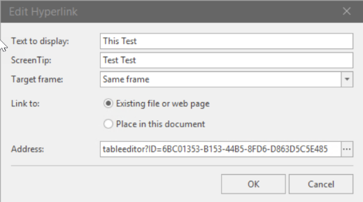
Click Ok and Save the design.


Example 2: Include hyperlink to open a dashboard from another dashboard\ For this second example we will insert a text box widget and create a text field that reads 'Click here for the Demand Classification- Drilldown Dashboard'. Right-click and select Edit, then select Hyperlink from the Insert tab ribbon.
Use the following link format to create the Hyperlink, just replace ID with the correct value from [SecuredItem] ID of the document. Click Ok and Save the design.
Text:\ arkieva://Arkieva/api/ui/reporting/reportviewer.Dashboard?ID=107F341E-AB91-4BCF-BFF6-45C7FF7AB99E
In this case, you will be will sent to the respective drilldown report, i.e. 'Demand Classification - Drilldown'.

Edit Names
To change the title of the Dashboard, click the Title button in the Dashboard section of the Dashboard Design ribbon. The Dashboard section contains options that can affect the dashboard globally.

Click the Title button to launch the Dashboard Title window. In the Text field, type the title for the Dashboard. Click Apply, then OK.


To change the names of individual dashboard inserts, right-click that insert and select Edit Names. Then type the name in the Dashboard item name field. Click Ok.


Scatter Chart
Visualization of data within a scatter chart that can be weighted.


Scatter Chart Data ribbon\ Use the data ribbon to filter the scatter chart data.
Data ribbon
Scatter Chart Design Tools ribbon
Design ribbon
Common
- Show Caption: Toggle on or off the Caption which will show the Dashboard item name.
- Edit Names: Click the Edit Names button to launch the Edit Names window. Here you can edit the Dashboard item name, Dashboard item component name, X-axis name, Y-axis name, and the Weight name.
Diagram
- Rotate: rotate the scatter chart to show the x-axis on the left and the y-axis on the bottom, or vise-versa.
- X-Axis Settings: Under the common tab, select settings for the X-axis; Reverse, Show grid lines, Show axis, Show title (default text or custom text), and Logarithmic scale. Under the numeric format tab select how to show the data numerically.

- Y-Axis Settings: Under the common tab, select settings for the Y-axis; Always show zero level, Reverse, Show grid lines, Show axis, Show title (default text or custom text), and Logarithmic scale. Under the numeric format tab select how to show the data numerically.

Labels
- Point Labels: Click the Point Labels button to launch the Point Label Settings window. Check the Show Point labels to activate the point labels settings. From here you can select the Content, Overlapping Mode, Orientation, and Position of the point labels.

Legend
- Show Legend: Toggle the legend on or off.
- Legend: Select where to place the legend; Inside Horizontal, Inside Vertical, Outside Horizontal, or Outside Vertical.
Gauges
Displays data in a series of gauges. Each gauge can communicate two values: one with the needle and other as markers on the scale.


Gauges Tools Data ribbon\ Select how you would like to filter the gauge widget data.

Gauges Tools Design ribbon

Common
- Show Caption: Toggle on or of the caption for the gauge widget.
- Edit Names: Click the Edit Names button to launch the Edit Names window. Here you can edit the Dashboard item name, Dashboard item component name, and Values names.
Content Arrangement
- Select how to arrange the gauges in the dashboard gauge widget: Auto Arrange, Arrange in Columns, and Arrange in Rows.
Style
- Select a style of gauge to display in the dashboard gauge widget: Full Circular, Half-Circular, Left-Quarter Circular, Right-Quarter Circular, Three-Quarter Circular, Linear Horizontal, and Linear Vertical.
Labels
- Show Gauge Captions: Toggle on or off the gauge captions.
Cards
Displays a series of cards each illustrating the difference between two values. This can be expressed as absolute or percent variation.

Cards Tools Data ribbon\ Make selections on how to filter the cards widget data.

Cards Tools Design ribbon

Common
- Show Caption: Toggle on or off to show the caption for the cards dashboard widget.
- Edit Names: Click the Edit Names button to launch the Edit Names window. From here you can edit the Dashboard item name, Dashboard item component name, and Cards names.
Content Arrangement
- Make a selection on how to arrange the cards in the cards dashboard widget: Auto Arrange, Arrange in Columns, or Arrange in Rows.
How to Generate a Geographical Map-based Report
Learn to report Geographical data on maps in Arkieva reports.
{`
`}
Text Box
Inserts a text box to display text input from the user. This can be used to display data and labels with familiar formatting functionality to Word.


Text Box Tools Design ribbon
Common
- Show Caption: Toggle on or off the text box caption.
- Edit Names: Edit the Dashboard item name and Dashboard item component name.
Editing
- Edit: Edit the inserted text field.
- Insert Field: Insert text field.

Text Box Tools Data ribbon\ Select how to filter the data for the text box.

Text Box Editor File ribbon\ Under the Common section, you can Undo and Redo changes made to the text box, as well as Open a text file to import into the text box.

Text Box Editor File Home ribbon\ Use Clipboard, Font, Paragraph, Styles, and Editing tools.

Text Box Editor File Insert ribbon\ Insert Tables, Illustrations, Links, and Symbols into the Text Box.

Text Box Editor File Page Layout ribbon\ Change the Page Color of the background of the text box.

Text Box Editor File Design ribbon\ Design a table for the text box with the table style options, table styles, an borders and shadings tools.

Text Box Editor File Layout ribbon\ Use the Table, Rows and Columns, Merge, Cell Size, and Alignment tools to change the layout of the text box.

Text Box Editor File Format ribbon\ Use the Shape Styles and Arrange tools to change the format of the text box.

Group
Creates a grouping to arrange dashboard items and allows you to manage interactions with dashboard items within and outside the group.

Select how to filter the group data with in the Groups Tools Data ribbon.

With Show Caption toggle on or off the groups caption, and click Edit to edit the Dashboard item name and Dashboard item component name.

Images
Allows import of images for use graphically.


Export to PDF
Users have the option to export the entire dashboard or each dashboard item individually as a PDF.
Click the export button located on the top right of the dashboard and select Export to PDF.

The Export to PDF window will launch, change any desired options and click Export to export the Dashboard to Excel.


You can also click the export button on each individual dashboard item and export that to PDF.

Click Export.


Rolling Window Time Filters
You can create a rolling window time filter for the dashboard by using the Range Filter Edit Periods or the Edit Filter option. These options will help you avoid manually updating the filter every time a new time period begins.
Range Filter
In this example we have added a Chart item and a Range Filter.

Right click the Range Filter and select Edit Periods. The Edit Periods window will launch.

Click the 'Add Custom Period...' button to launch the Period window.

In the period window, select Custom. Select Flow for the Start and End Point options. and select Month for each interval. For this example we have typed -4 for the Start Point Offset, and 4 for the End Point Offset.
Click OK.

Check the Default checkbox for the custom period. and click Close.

The Chart and Range Filter are now configured as a rolling window time filter.

Filter Editor
Below we have added a Chart item to the dashboard layout.

Right click the chart and select Edit Filter.

The Filter Editor window will launch. Start by adding a new condition.

Below is an example of a custom filter. Click Apply, then click OK.

The chart has now been configured for the rolling window time filter.

Conditional Format Dashboard
How to Design Multiple Dashboards in One View for Your Planning Session
Set up multiple dashboards in one interface to help navigate through your planning season.
{`
`}
Advanced Setup of Multiple Dashboards
Learn how to design dashboards for your business to report on Metrics and KPIs in Arkieva.
{`
`}
How to Setup Drill-downs in Your Arkieva Solution
Extract more insights from your supply chain data with advanced drill-downs.
{`
`}
Related Articles
Insights
The following serves as an introduction of how the Arkieva Insights software can be implemented as part of a multinational’s IT landscape. This is intended for IT project managers that are planning or considering the implementation of Arkieva ...S&OP Introduction
Why Sales and Operations Planning (S\&OP)?\ Sales and Operations Planning (S\&OP) has been around for decades. S\&OP is much more than just a meeting – it takes into account all the various planning and monitoring processes that are necessary to run ...Supply Planning Introduction
One of the most critical tasks for any manufacturing organization is balancing assets (e.g., capacity, materials, people) with demand. Planners must determine how best to meet the demand given (1) available assets, (2) the production and distribution ...Promotion Planning
Introduction Running promotions to increase sales is an essential part of the product marketing process. The Arkieva Promotions Planner provides powerful forecasting analytics tools that help you quickly align your promotions with your demand or ...General Navigation of Arkieva
Overview of the various navigational commands in Arkieva. {` `} Launching Arkieva Splash Screen Arkieva is installed to a web server and launched from the client intranet (Internet Explorer is highly recommended). The Arkieva version number, build ...